Benjamin Moore Hale Navy HC-154
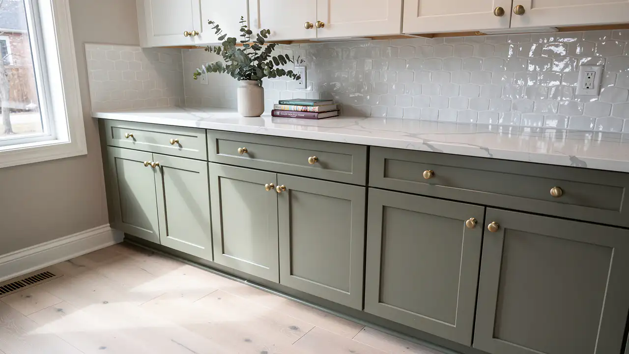
A deep navy with a grey edge that reads classic rather than trendy. It looks sharp on an island with white quartz and brass pulls.
Benjamin Moore and SW colours
Choosing a colour is the fun part of a cabinet project, and the part people second-guess most. At Kitchener Elite Cabinet Painting & Refinishing we spray any Benjamin Moore or Sherwin-Williams colour, and over 1,700 jobs since 2010 we've learned which shades look right on a door in Waterloo Region light and which look nothing like the chip.
Soft whites still lead, but deep greens, navy and warm greige are now regular requests, often as a second colour on an island. Every colour here is a real code you can take to a paint store, and we spray a sample door in your pick before your kitchen cabinet painting project begins.
Choosing a colour
Start with what isn't changing: the floor, the countertop and the light from your windows. A colour that suits all three will look right, while one picked from a photo online often won't.
North-facing kitchens get cool, bluish light that turns crisp whites grey, so warmer whites like White Dove or Swiss Coffee hold up better. South and west light is warm and can push creamy whites toward yellow, which is where Chantilly Lace or Pure White shine.
Hold the chip against your countertop and floor, not a white wall. Warm oak floors and beige granite pair with warm whites and greige, while grey-veined quartz and cool tile suit cleaner whites, navy and charcoal.
Very light and very dark colours both show more: crumbs and scuffs on bright white, dust and fingerprints on near-black. Mid-tone greige and muted green forgive the most.
Warm LED bulbs around 2700K make every colour warmer at night, while 4000K bulbs cool it down. Judge your sample in daylight and under your own evening lights.
Whites
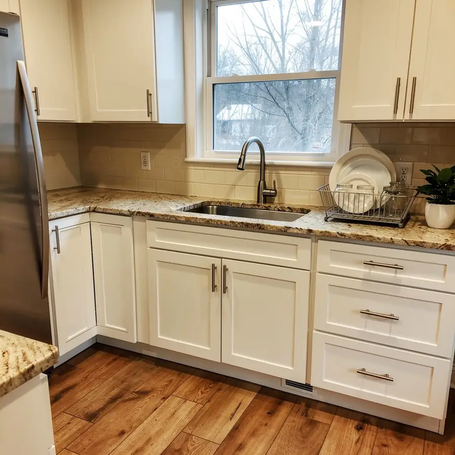
White cabinets are still the most common choice, but the right white depends on your light and your counters. Each of these is a reliable cabinet white with its own character.
| Colour | Code | Undertone | Looks best with |
|---|---|---|---|
| Benjamin Moore White Dove | OC-17 | Soft warm white with a hint of grey | Oak or walnut floors, warm quartz, brass hardware |
| Benjamin Moore Chantilly Lace | OC-65 | Clean, bright, close to neutral | White quartz, marble-look counters, modern slab doors |
| Benjamin Moore Simply White | OC-117 | Warm with a slight yellow glow | Butcher block, cream tile, farmhouse styling |
| Benjamin Moore Swiss Coffee | OC-45 | Creamy and soft | North-facing rooms, beige granite, oak floors |
| Sherwin-Williams Pure White | SW 7005 | Balanced soft white | Almost any counter; a safe pick for mixed light |
| Sherwin-Williams Alabaster | SW 7008 | Warm, creamy white | Warm wood, black hardware, cottage-style kitchens |
| Sherwin-Williams Extra White | SW 7006 | Crisp and cool | Grey quartz, stainless steel, condo kitchens |
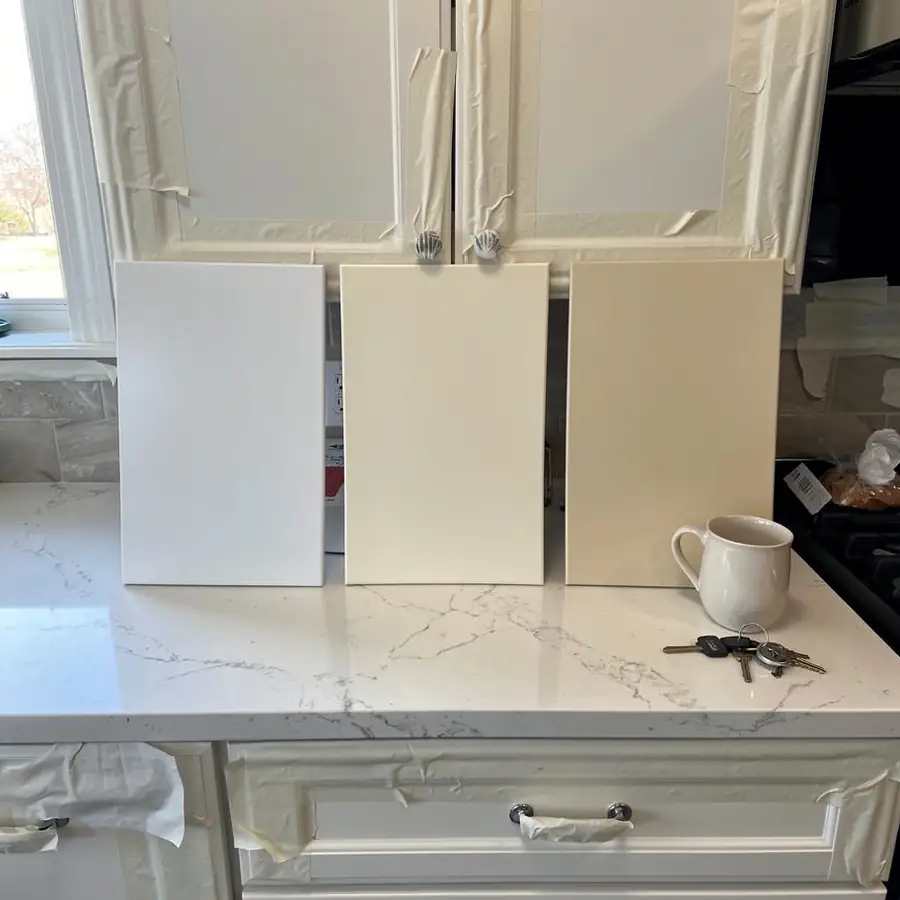
Whites look brighter on a large door than on a small chip, so a white that seems too stark on the card often looks right on the cabinets. Covering dark stained wood with any white may take a third topcoat, which we include.
Deep colours
Dark cabinets bring depth and hide everyday scuffs on lower runs, which is why many people use them on the island or the base cabinets only. These colours spray beautifully and pair well with brass, black or nickel hardware.
A deep navy with a grey edge that reads classic rather than trendy. It looks sharp on an island with white quartz and brass pulls.
A richer, darker navy that turns close to ink in low light. It's at its best in a kitchen with good daylight.
A soft grey-green that sits between neutral and colour. It can cover a full kitchen without feeling heavy and suits warm wood floors.
A muted, earthy sage that feels at home in older houses. It pairs well with cream tile, butcher block and natural wood shelves.
A soft near-black charcoal that's gentler than true black. It's a favourite for islands and lowers under white uppers.
A deep charcoal with a warm brown cast. It looks rich in satin and shows dust less than pure black.
Neutrals
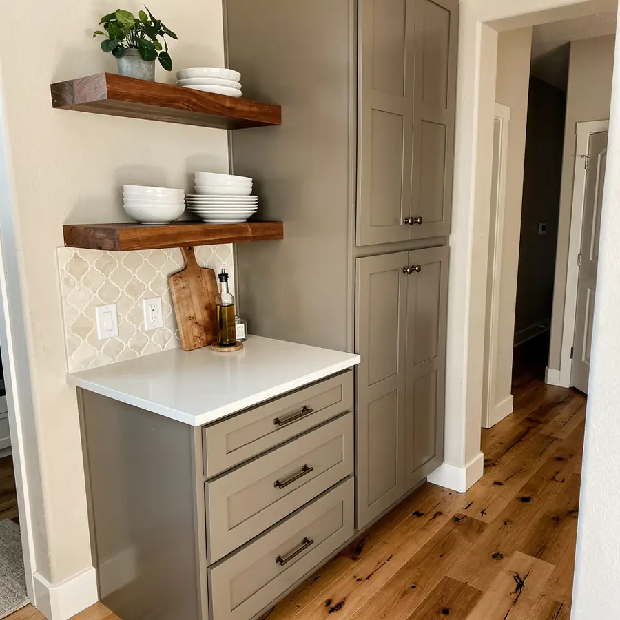
Greige, a blend of grey and beige, is the safest pick if you want colour without commitment or plan to sell in a few years. These mid-tones hide fingerprints and crumbs better than white or black.
| Colour | Code | What it looks like |
|---|---|---|
| Benjamin Moore Revere Pewter | HC-172 | Warm mid greige with a slight green-grey cast |
| Benjamin Moore Edgecomb Gray | HC-173 | Light, soft greige that reads almost off-white in bright rooms |
| Benjamin Moore Pale Oak | OC-20 | Very light greige with a hint of pink-beige |
| Sherwin-Williams Agreeable Gray | SW 7029 | Light warm greige that behaves in almost any light |
| Sherwin-Williams Accessible Beige | SW 7036 | Warm beige-grey that sits well beside oak floors and granite |
| Sherwin-Williams Urbane Bronze | SW 7048 | Deep bronze-brown neutral for islands and lowers |
Home sellers often book cabinet painting 2 to 3 weeks before listing photos, and a light greige or soft white is the usual choice because it suits the widest range of buyers.
Two colours
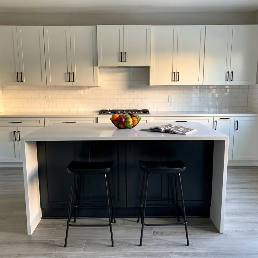
Most two-tone kitchens pair a light colour on the uppers with a deeper one on the island or lowers. The darker colour grounds the room and the lighter one keeps it bright, and our two-tone kitchen cabinet painting service covers where to split them.
A second colour is a flat add-on listed on our cabinet painting price list, and both colours are sprayed and matched in the same sheen.
Sheen
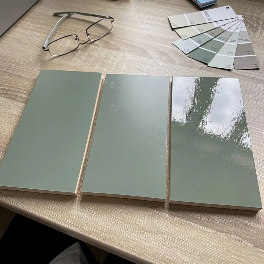
Satin is the best all-round sheen for cabinets: it hides wood grain and small flaws better than semi-gloss and wipes clean more easily than matte. It's our default unless you ask for something else.
| Sheen | Gloss level | Look | Cleaning | Hides grain and flaws |
|---|---|---|---|---|
| Matte | About 10 to 15% | Soft, modern, low reflection | Wipes clean, but can polish shiny where it's rubbed often | Best |
| Satin | About 25 to 35% | Gentle glow, the classic cabinet finish | Easy | Good |
| Semi-gloss | About 50% | Shiny and traditional | Easiest | Shows the most grain and dents |
Sheen also changes how a colour reads: the same navy looks deeper in matte and brighter in semi-gloss. Shop-sprayed doors and site-sprayed boxes are matched in sheen, so the kitchen reads as one finish.
Sample door
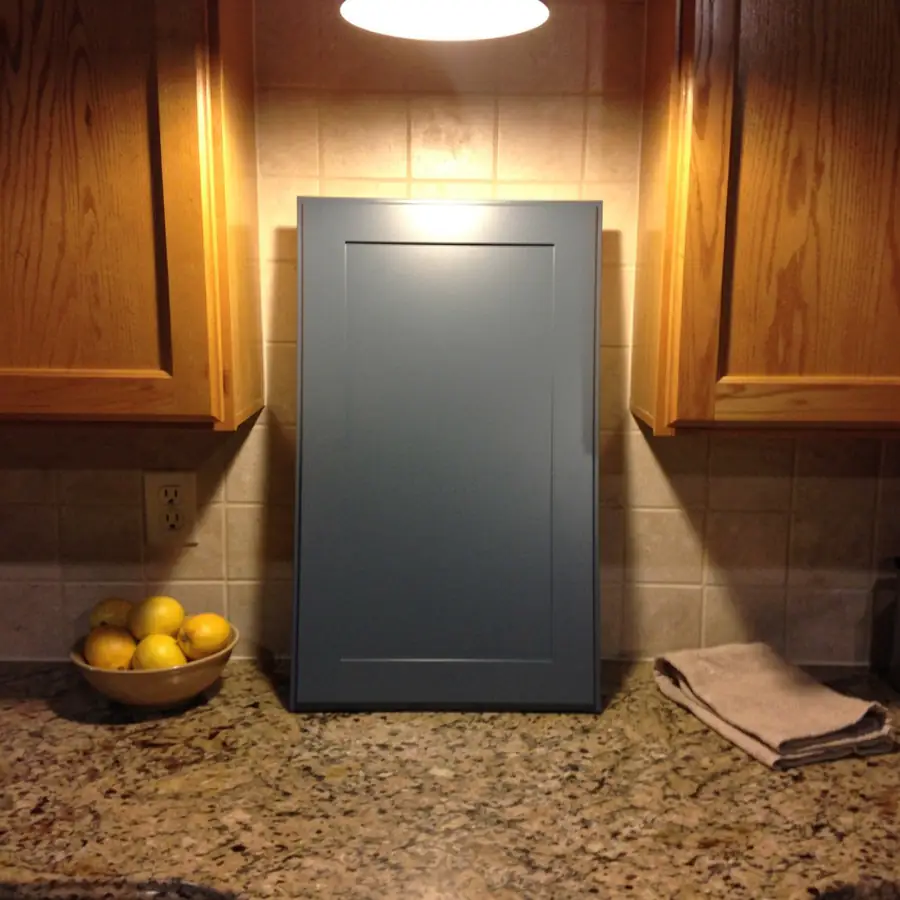
A sprayed sample is the only reliable way to judge a cabinet colour, because a chip is too small and too flat to show how a colour behaves on a door. Before your project starts, we spray a sample door or board in your chosen colour and sheen.
Torn between two colours? Try one against the island and one against the perimeter, which is how plenty of people end up with a two-tone kitchen.
Colour consult
Not sure where to start? Book a free estimate and we'll talk through colours with your counters and floors in front of us, then spray a sample door before anything is painted.